
7 Mistakes You're Making with Your Mobile Website (and How Middletown Businesses Can Fix Them)

Your Middletown business is losing customers every day. Why? Your mobile website sucks.
60% of web traffic comes from mobile devices. That's not a trend anymore. That's reality. And if your mobile site isn't working, neither is your business.
Here's what Middletown businesses get wrong with mobile websites. And how to fix it fast.
Mistake 1: Your Site Loads Like Molasses in January
Three seconds. That's how long people wait before they click away from your site. After three seconds, 40% of visitors are gone. GONE.
Your pizza place, dental office, or retail shop could have the best products in Middletown. Doesn't matter if your site takes 8 seconds to load.
The Fix:
Compress your images. Use TinyPNG or similar tools. Enable browser caching on your server. Get better hosting if you're on a $5/month plan.
Test your speed with Google PageSpeed Insights. Aim for a score of 70 or higher on mobile. Below 70? You need help.

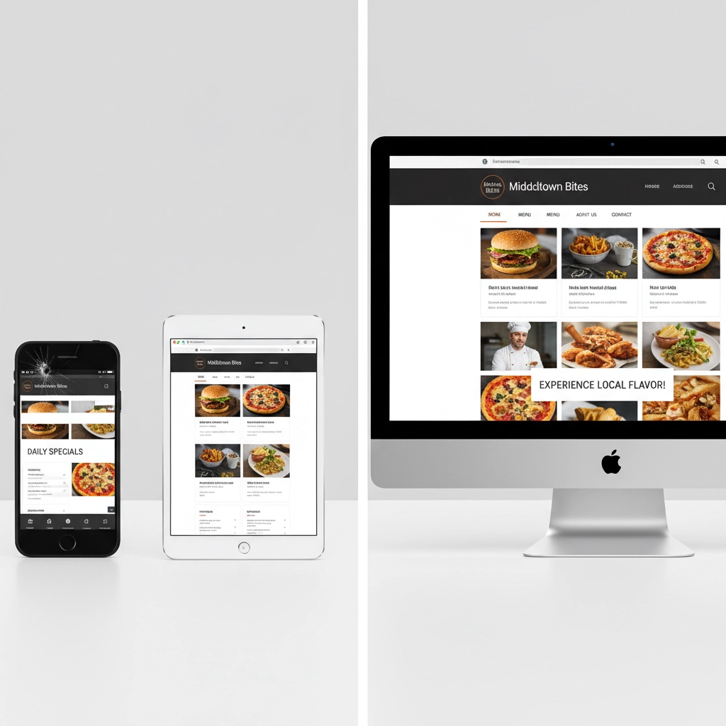
Mistake 2: Non-Responsive Design That Breaks Everything
Responsive design means your website adapts to different screen sizes. No responsive design means visitors pinch and zoom just to read your menu or contact info.
Picture this: Someone searching for "best restaurants Middletown NJ" finds your site. They can't read your menu because the text is microscopic. They leave. They order from your competitor instead.
The Fix:
Use CSS frameworks like Bootstrap or CSS Grid. These automatically adjust your layout for different devices. Your web developer should know this. If they don't, get a new developer.
Test your site on multiple devices. iPhone, Android, tablets. All of them. Use tools like Responsinator for quick testing.
Mistake 3: Navigation That Makes People Work Too Hard
Mobile screens are small. Your desktop navigation with 15 menu items doesn't work on a phone. People can't find what they need. They leave frustrated.
The Fix:
Use a hamburger menu (those three lines that open a menu). Keep it simple. 5-7 menu items maximum.
Put your most important stuff first:
- Contact info
- Services/Products
- Location/Hours
- About
Everything else is secondary.
Mistake 4: Weak Calls-to-Action That Don't Convert
"Click Here" tells people nothing. "Learn More" is vague garbage. Your CTAs should be specific and actionable.
Bad CTA: "Click Here"
Good CTA: "Call Now for Same-Day Service"
Better CTA: "Get Your Free Quote Today"
The Fix:
Make your CTAs specific. Tell people exactly what happens when they click. Use action words:
- "Schedule Your Appointment"
- "Order Online Now"
- "Get Directions"
- "Call (732) XXX-XXXX"
Make CTA buttons big enough to tap easily. 44px minimum height. Use contrasting colors so they stand out.
Mistake 5: Ignoring Different Screen Sizes
Your site looks great on your laptop. But what about on a Samsung Galaxy? iPhone SE? iPad?
Different devices have different screen widths. Your content needs to adapt to all of them. Images that look perfect on one device might be cut off or too small on another.
The Fix:
Set maximum widths for your content containers. Use percentage-based widths instead of fixed pixel widths. Test on multiple devices regularly.
Use flexible images that scale with screen size. Set images to max-width: 100% in your CSS so they never overflow their containers.

Mistake 6: Too Much Clutter and Information Overload
Mobile users have short attention spans. They're often multitasking. Walking, driving (as passengers), waiting in line.
Bombarding them with pop-ups, notifications, and walls of text kills conversions. Keep it simple. Focus on what matters most.
The Fix:
Use white space. A lot of it. Don't fill every pixel with content.
Limit pop-ups. Maybe one, maximum. And make it valuable – discount codes, important announcements.
Break up text with headers, bullet points, and short paragraphs. Nobody reads walls of text on mobile.
Mistake 7: Not Testing Your Site Regularly
You built your site two years ago. It worked great then. But iOS updates, Android updates, new devices – things change. Your site might be broken on newer devices and you don't even know it.
The Fix:
Test monthly on different devices and browsers. Use tools like BrowserStack to simulate different environments.
Get feedback from real customers. Ask them about their mobile experience. Set up simple surveys.
Keep your website updated. Old code breaks on new devices. Regular maintenance prevents problems.

The Bottom Line for Middletown Businesses
Mobile isn't the future. It's right now. Today. Your competitors who get this right are stealing your customers.
Start with speed. Fix your loading times first. Then tackle responsive design. Then navigation and CTAs.
Don't try to fix everything at once. Pick the biggest problem and solve it. Then move to the next one.
Your mobile website is often the first impression customers have of your business. Make it count.
Need help fixing these issues? Professional web design makes the difference between a site that converts and one that loses money. Check out our website design services to see how we help Middletown businesses succeed online.
#MiddletownNJ #NJBusiness #MiddletownWebsiteDesign #MobileWebNJ #WebDesignNJ #MiddletownMarketing #MonmouthCountyBusiness #NJSmallBusiness #MobileOptimization #LocalBusinessNJ
Recent Comments